Learn how to generate aggregate reports based on dispatched assessments, apply filters, view results onscreen in different charts, and export data to Excel
In this article:
Creating a new report
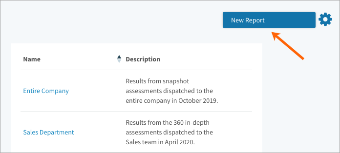
- Navigate to Assessments > Reports.
- Point to the gear icon on the top right of the page and select New Report.
- Click Submit to see a pie chart displaying the completion status of all assessments.
- Check out the other headings in this article to learn more about:
- Applying filters to onscreen and exported reports.
- Generating different types of onscreen charts.
- Exporting data to Excel in a Target Report or as Raw Data.
- Click Save on the top of the page. Enter a name and description and click Save.
Note: You can only access reports you’ve saved, not those created by other users.
Filtering data
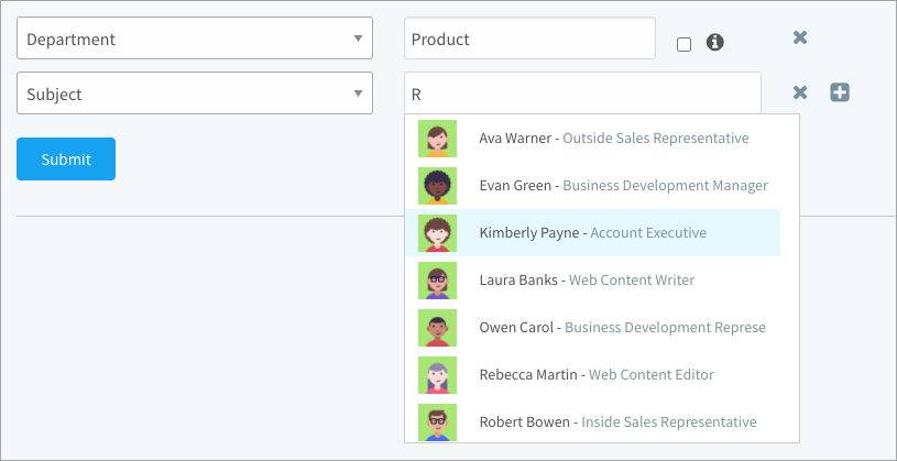
Follow the steps above to create a new report. Use the filters listed below to narrow the results.
- Dispatch Date
- Status
- Subject
- Manager
- Assessment
- Job
- Participant Group
- Department (Select the checkbox to include sub-departments)
- User Group (Select the checkbox to include sub-groups)
Note: Two of the same filters are treated as an OR; two different filters as an AND.
Generating onscreen reports
Follow the steps above to create a new report. The Completion Status chart displays by default. Click the Switch Chart button on the right side of the page to open a window where you can switch between three other charts.

Chart 1: Completion Status
See how many dispatched assessments are not started, in progress, or complete. If you save this chart, you can pin it to your dashboard for a quick view of assessment completion status.
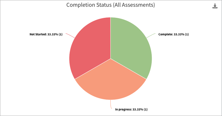
Chart 2: Performance Against Target
For each competency, see the percentage of ratings that assessed the subject as below, at, or above target. Click the N button on the right side of the page to display the number of responses rather than the percentage. This gives you a better idea of which competencies have more ratings because they’re included in more assessments.
Snapshot: The target is the competency level required on the job.
In-depth: The target is typically the “Fully Effective” level from the Effectiveness scale.
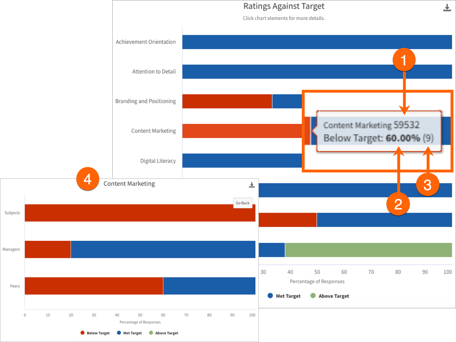
Hover over a section of the bar chart to get more info.
- The competency ID number.
- The percentage of responses where Client Focus was rated at target.
- The number of responses that the percentage represents.
- Click a bar to zoom in and see ratings broken down by participant group.
Chart 3: Not Applicable Responses
See the top 10 competencies rated as “Not Applicable” most often across dispatched assessments. Note that not all assessments necessarily provide participants with the option to select N/A. Here’s how it works for each type of assessment:
Snapshot: When creating a snapshot assessment, you can choose to provide the option for participants to select “Not Applicable” for each competency on the assessment.
In-depth: Unlike snapshot where N/A is configured when creating individual assessments, N/A is turned on or off for all in-depth assessments with a setting that you can change on the Effectiveness scale. Check out the manage scales article to learn more.
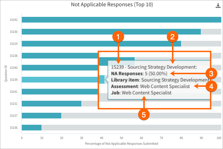
Hover over a highlighted section of the bar chart to get more info:
- The competency ID number.
- The name of the competency that was rated as Not Applicable.
- The number and percentage of NA responses for this competency on this assessment. Hover over the grey side of the bar to see the number and percentage of rated responses.
- The assessment where N/A was selected. Each bar represents a separate assessment. For example, if Organizational Awareness was rated as N/A on another assessment (even one based on the same job), those results would be displayed in a separate bar.
- The job description associated to the assessment where N/A was selected.
Note: If fewer than 10 competencies have been rated as N/A, you’ll see competencies not rated as N/A listed in grey below the N/A competencies.
Chart 4: Ratings Distribution Pattern
For each competency, you’ll see how the ratings are distributed across the selected scale. Click the N button on the right side of the page to display the number of responses rather than the percentage. This gives you a better idea of which competencies have more ratings because they’re included in more assessments.
Snapshot: Select the Proficiency Levels scale to get a closer look at snapshot assessments.
In-depth: Select the Effectiveness Scale to get a closer look at in-depth assessments.
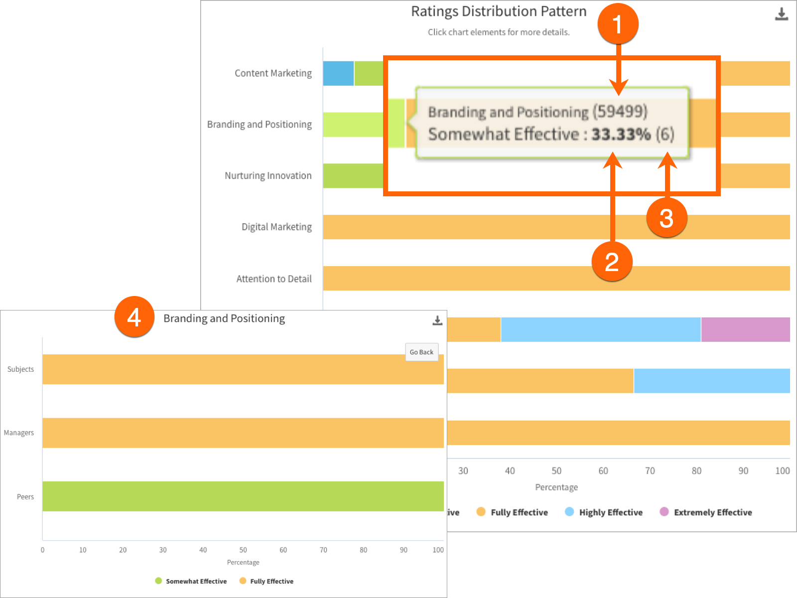
Hover over a section of the bar chart to get more info.
- The competency ID number.
- The percentage of responses where Client Focus was rated at target.
- The number of responses that the percentage represents. This number is higher when viewing the results of in-depth compared with snapshot assessments. For in-depth, each participant rates several behaviours from the required proficiency level on the competency, and each behaviour is counted as a separate response. For snapshot, participants are only submitting one response per competency.
- Click a bar to zoom in and see ratings broken down by participant group.
Generating Excel reports
Option 1: Raw Data
This report gives you detailed information about assessments. Everything from the question text to each participant’s response is included in the Raw Data export.
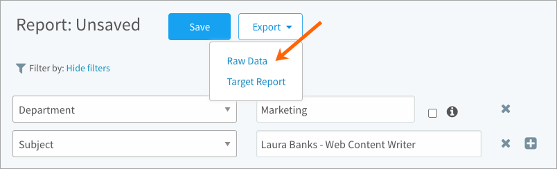
Option 2: Target Report
This report gives you a more focused look at whether an employee was rated below, at, or above target for each competency being assessed. Note that the score is based on their manager’s rating; this report ignores ratings from peers and subordinates.
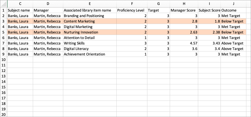
Don’t forget to use the on-screen filters if you want to narrow in on the results of a particular department, employee, or assessment. In the screenshot above, we’ve filtered down to our Sales department. At a glance, we can see that the employee in the screenshot above was rated below target for “Nurturing Innovation” and “Content Marketing”, but the remaining competencies were rated at or above target.
The following columns are included:
- Assessment Name
- Dispatch Date
- Subject
- Manager
- Competency
- Proficiency Level (N/A for snapshot assessments)
- Target (for in-depth, this would typically be 3 from the Effectiveness scale):
- 1: Limited Effectiveness
- 2: Somewhat Effective
- 3: Full Effective
- 4: Highly Effective
- 5: Extremely Effective
- Manager Score (average score; peers and subordinate scores are ignored)
- Subject Score (average score; N/A for manager-only assessments)
- Outcome (Below, Met, or Above target based on the manager’s score)
Note: A Raw Data or Target Report respects filters, but is not affected by the chart type you’re viewing onscreen (Completion Status, Ratings Distribution Pattern, etc.). To export onscreen reports, click the download icon and select a file format.